Overview
fuboTV, a sports-forward streaming service, was facing mounting complaints from users who thought they had canceled their subscriptions only to find they were still being charged. Failed cancellations were the primary subject of customer service calls, and some users were leaving negative app reviews and even reporting the charges to their credit card companies.
My design partner and I spent several months in late 2019 designing an overhaul of the cancellation experience on web, focusing on how to mitigate failed cancellations while also providing an overall cleaner and more cohesive user journey. I was hands on in mapping flows for four user cohorts, and wrote the final copy. I also organized weekly syncs and co-presented all of our thinking to stakeholders and in design critiques.
We did not end up launching the full redesign because the pandemic led to a pivot in priorities, but we were able to apply some of our recommendations as we made incremental improvements to the offboarding experience over time.
Evaluating the existing experience
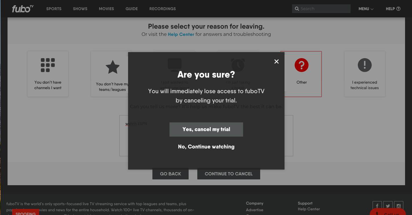
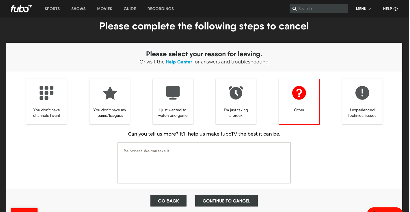
Users had only a couple steps to get through but were dropping off before they’d completed them. The most common dropoff point was a survey that’s presented when users first hit “Cancel Subscription” from their account page:
Users were also dropping off when they were prompted to accept a one-time discount offer. It appears after they complete the survey and they must accept or reject it before their cancellation is processed.
We had to rethink the cadence and content of these screens—and strong messaging would be key to that.
Competitive audit
I researched how other services handled cancellation, noting pacing and tone of voice. Sometimes the process felt too drawn out, as with Hulu, which inserts a suggestion to pause, followed by a survey, and then a “don’t miss out on great content” screen before the cancellation goes through. Netflix’s flow felt too condensed, with a single screen containing instructions on reactivating, a downgrade suggestion, as well as “are you sure?” messaging.
We set about figuring out how to give users opportunities to change their minds without coming off as pushy or needy. Tonally, I would have to strike a balance between “off you go” and “but are you really, really sure?”
I set some guiding principles:
Be explicit at every intermediate step that the user’s subscription hasn’t been canceled yet.
Clarify the implications of every choice, such as telling them exactly when they will lose access.
Be precise in button copy in order to increase user confidence.
User cohorts
Trial subcribers
Profile: Users that are in the 7-day free trial period. Not a high priority to retain as many of them signed up just to watch one game. Still very important to get them through cancellation successfully; these users are the most likely to raise a stink over a surprise charge.
Key to success: Get them out efficiently.
Existing experience:
Paid subcribers who qualify for a coupon
Profile: Users we entice to stay on by offering a discount on their next bill.
Key to success: Make sure they understand that they need to make a decision on the coupon in order to complete cancellation.
Existing experience:
Paid subscribers who qualify for a refund
Profile: Users that initiate cancellation after their first charge and are within a window to qualify for a refund. These are mostly users who have forgotten to end their trials or thought they did and failed.
These users are presented with two options:
1. Cancel the standard way and maintain access through the last day of the billing cycle.
2. Get a refund and lose access immediately.
Key to success: Explain the two options in the clearest terms and make sure they understand that they have to make a decision in order to complete cancellation.
This flow is identical to the previous, except that users are greeted with a modal upon selecting “Cancel Subscription”. More on the issues with this modal in a minute.
Considered and discarded
We had practically a blank slate to start from, which meant we could explore a lot of directions. Here are some options we entertained but ultimately let go.
1. Suggesting to users that they downgrade to a cheaper plan.
Our job was to shepherd them out if that’s what they really wanted, and adding new options for users would make it harder to test the efficacy of the new experience against the old. The retention team would turn the gas on once people were scheduled for cancellation, targeting them with offers including suggestions to downgrade.
2. A progress bar.
This was an obvious thing to try based on the problem we were facing, but we figured that users had to go through at most two steps, so if we did everything right, we wouldn’t need that UI element.
3. “One-click unsubscribe” for trial users.
We explored placing copy contextual to the Cancel button telling trial users that they would lose access immediately, and once they hit it, they’d go straight to a confirmation screen.
We realized this approach was jarring, not to mention visually ugly, and could seem like we didn’t care that they were leaving. In our quest for maximum efficiency, we almost overcorrected.
Where we landed
Trial subscribers
Our existing “Cancel Subscription” button is not a button at all, but a text link at the bottom of a secondary page in My Account. For trial subscribers, we inserted a module at the top of their account page, so that they would not have to hunt for a way to cancel.
I changed the button text to “End trial”, which is easier to understand; trialers likely don’t think of themselves as subscribers.
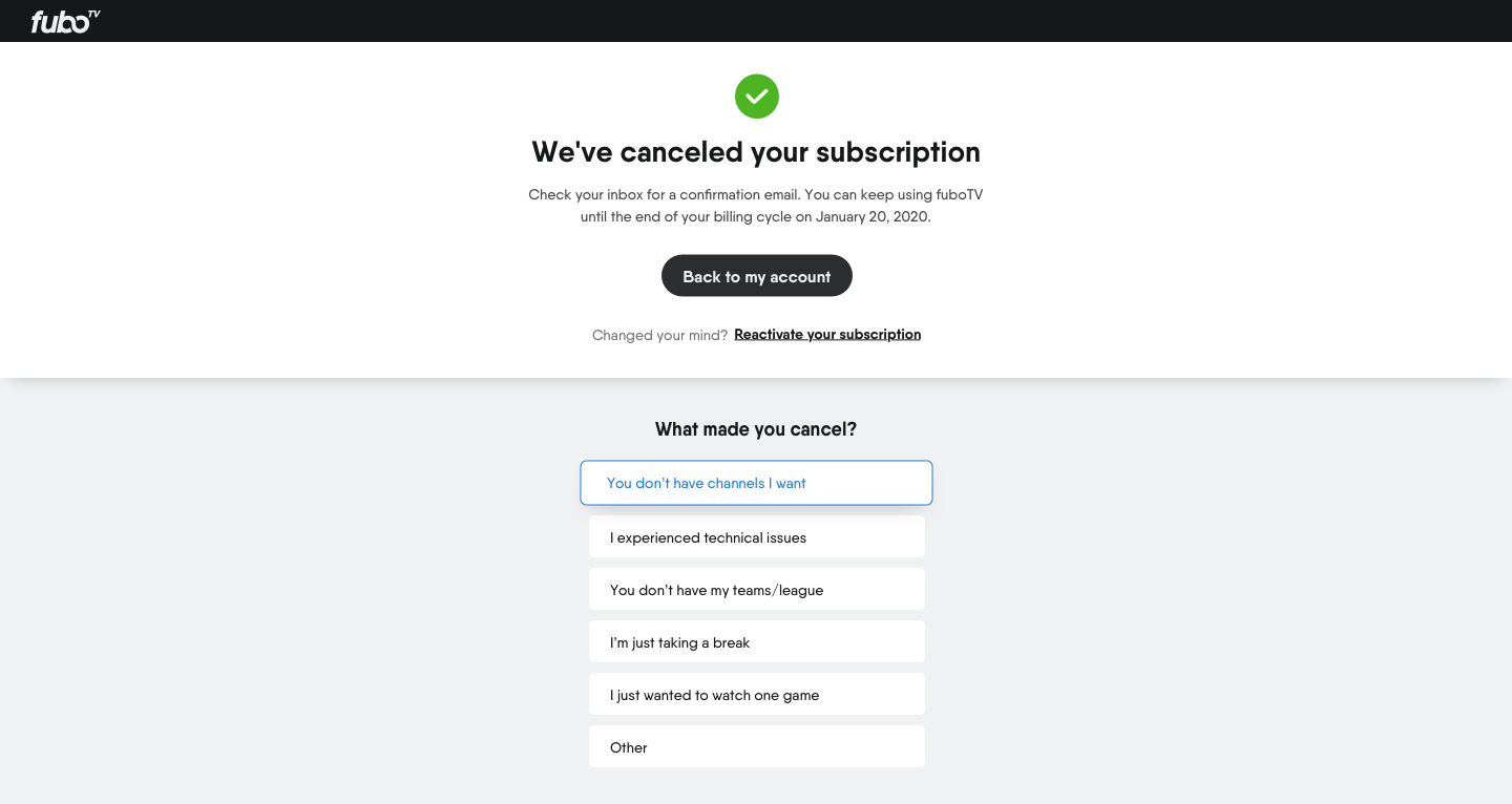
After abandoning our “one-click unsubscribe” idea, we inserted an “Are you sure?” screen, which is both unobtrusive and customary, and wasn’t going to encourage dropoff.
While moving the survey to the end meant that fewer people would fill it out, this was preferable to failed cancellations.
I chose the survey heading “What made you cancel?” because it was more friendly and positive (in line with the fuboTV voice) than examples I’d seen elsewhere, which included “Why did you cancel?” and “What went wrong?
Paid subscribers who qualify for a coupon
Instead of including an “are you sure?” modal in this flow, we determined that the offer screen effectively acts as a moment for users to reconsider. To convey to users that they can’t pass go without taking action on the coupon, we chose a fullscreen treatment and stripped out all the channel logos, as they didn’t relate to the concept of a discount.
I wanted to be unmistakably clear that the user had not completed cancellation, hence the “Before we complete…” phrasing. I wanted the copy in each CTA to acknowledge the offer, and went with a conversational “No thanks, just cancel” for those that weren’t going to bite. “Finish cancellation” or “Cancel subscription” would not have accomplished that.
This is the experience when people take the offer:
We created a confirmation screen for those that accept the coupon, which did not exist in the legacy experience. Users would not get an email or see an "upcoming discount" indication in their account, and I wanted them to get confirmation that they’d redeemed the offer. Instead of something like “discount applied”, I went with a headline that felt more human and caring as well as affirmed the action. We again kept it fullscreen, to make the experience have a smooth horizontal trajectory.
The confirmation screen for paid subscribers differs from that of trials. Since paid subscribers can use the service through the end of their billing cycle, I wanted to note their final day on the confirmation page, as the date would not be included in the confirmation email.
One of our stakeholders wanted users to be able to easily reactivate their subscriptions, and we initially placed a “Reactivate” button on the confirmation page. But after sleeping on it, we realized it was being given too much weight. I reasoned that no one would hit that button 5 seconds after canceling unless they’d canceled in error. So a text link won out.
Paid subscribers who qualify for a refund
Revising the cancellation options screen was the most challenging task for me. The existing modal did not properly explain the two options.
Fixing these issues meant moving things to another surface. While most users take the refund, we didn’t want to prioritize one button over another. With a modal, we would have to. And there was simply no way to convey the complexity of the two options through a headline, subcopy, and two buttons.
We again expanded the experience to fullscreen, which gave each option more room to breathe. In this early draft, I was able to make some improvements on the previous experience but even with the extra space, it was difficult to convey everything a user would need to make a decision.
After several revisions, this is where we landed:
As with trial users, when users take the refund, they lose access right away, so they don’t have the “Back to my account” option on the confirmation page. Here’s the full flow for the refund-getters:
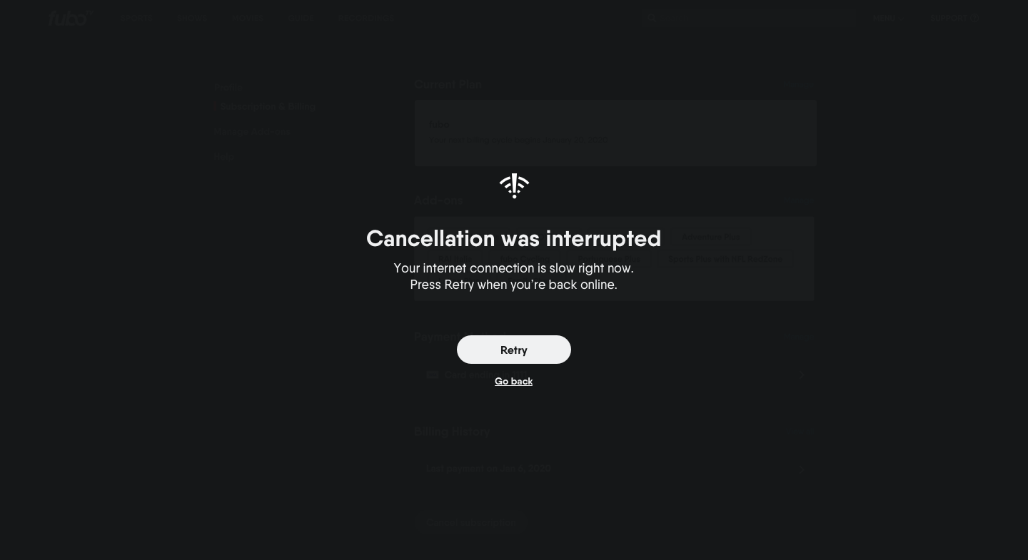
I also made sure that error messages were explicit about whether users had successfully canceled.
Epilogue
The work we did was very close to going live but was put on hold in order to address a new pressing issue around cancellation: users leaving due to the pandemic’s impact on sports and their wallets. We pivoted to create the ability for users to pause their subscriptions, including intercepting them with the suggestion when they initiate cancellation. So while we didn’t unveil a fully revamped flow and look, we introduced our proposed updates whenever we could. With the account pausing functionality, we took the opportunity to move the survey to the end of the flow. When we updated the coupon copy (without removing the channel logos), I made sure we added the coupon redemption confirmation screen into the experience.


![Trial Subs [My Account]_OneClick.png](https://images.squarespace-cdn.com/content/v1/566c983b57eb8de92a522db7/1609632485567-TZ1RCDT5QW4QFCOHUQRS/Trial+Subs+%5BMy+Account%5D_OneClick.png)


