Overview
For a decade, I worked as a copywriter at creative agencies that specialized in advertising, marketing, and brand strategy. I tackled my first UX project during my tenure at Sequence, where I spent three years writing copy for various Chipotle initiatives. In 2015, they enlisted Sequence to create or re-envision all of its ordering avenues, ensuring that everything was streamlined and contained that signature Chipotle visual and verbal flair.
I worked on the launch of the Chipotle Apple Watch app, a redesign of the desktop ordering experience, and updates to the mobile ordering app.
Apple Watch app
Chipotle partnered with Apple to be part of the first slate of apps released when the Apple Watch debuted. The app made the intended splash through a very appealing home interface: a large red graphic reading “Burrito Button” that screamed out to be tapped.
The order-for-pickup process had to be super simple at every step; it was meant to be the fastest way to get a Chipotle meal, and in the process, implicitly promote the joys of owning Apple’s flashy new accessory.
The app was designed for frequent orderers, as recent orders and favorite orders got ported in for easy re-ordering. Users could not construct an order within the app, so the challenge was designing and writing for the people who’d never ordered through Chipotle’s site or app before. Those without Chipotle accounts had to be directed to set themselves up through the iPhone app, designate a pick-up location, and enter their payment info. Interrupting the experience to tell someone they had to leave the experience in order to proceed was the trickiest bit for me to nail.
Here’s an excerpt of the flow, and some early, rather long copy.
We cut down the copy significantly (see below) and had to lose some of the voice to accommodate the seriously small screens.
Here are the final messages I wrote for various cases.
[Home screen] Unsuccessful first open or not signed in, location services off:
Hold up.
To order from your watch, you must sign in to the phone app, set a location, and have placed an order.
[Home screen] Location set but no orders yet:
Time out.
To order from your watch, you must first place an order from your phone or the web.
[Payment] Gift card balance exceeded – pay in store:
FYI.
You don’t have enough on your gift card to cover your meal. Please pay when you pick up.
[Payment] Card expired:
Hold up.
Your card appears to be expired. Please update your card info in the phone app and place your order again.
[Payment] No online payment right now, but can order and pay on arrival:
FYI.
This location is not accepting online payment right now. Choose another location or place an order here and pay when you pick up.
Once users successfully placed an order, we amped up the anticipation with a timer.
Desktop and mobile ordering experience
Next up in my Chipotle ordering odyssey was the overhaul of the desktop and mobile app in 2016. There are more screens and paths than you might imagine, requiring plenty of messaging to make people feel fully guided and never lost on the way through to payment.
One convenient feature Chipotle offers is group ordering, where one person sets it up and invites people to join via email. People submit their orders to her individually before she places the full order. I jumped in to write invitation email copy, and craft different messaging on the ordering screen for organizers and guests.
Here’s what you see when you click the link in the email to join a group order.
The design and UX team thought through what options for action a user should have at each step of the journey. I provided copy for some of the wireframes, and as we translated wires into designed screens, I wrote all copy down to the buttons. I also weighed in on the kinds of questions that bubble up when things start getting real:
Can people decide to leave a group order partway through assembling their order?
What do we tell people if their order times out due to inactivity?
A confirmation screen is an opportunity to prompt users to take another action, so what do we suggest they do?
We created new screens on the fly, and I wrote all the subsequent messaging. And, hovering together around monitors, we identified a couple screens that could be cut or consolidated, which is always a delightful outcome.
In regard to the first question above, we determined that group order invitees should be able to opt out in the middle of choosing black over pinto, and made sure to add the option across multiple screens.
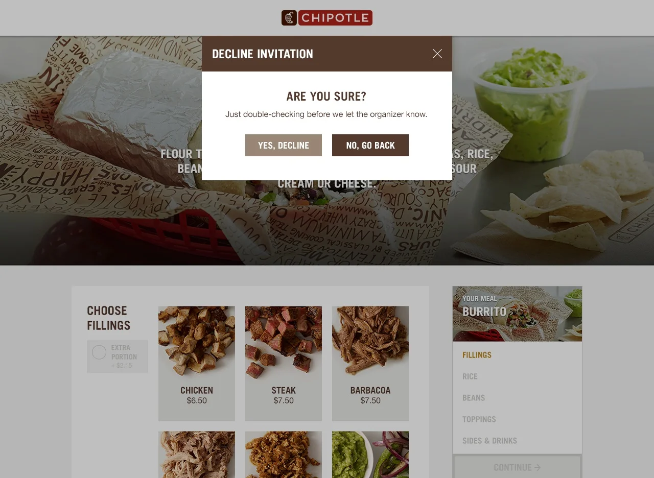
Here’s the overlay that displays when someone jumps ship mid-order, followed by the confirmation copy.
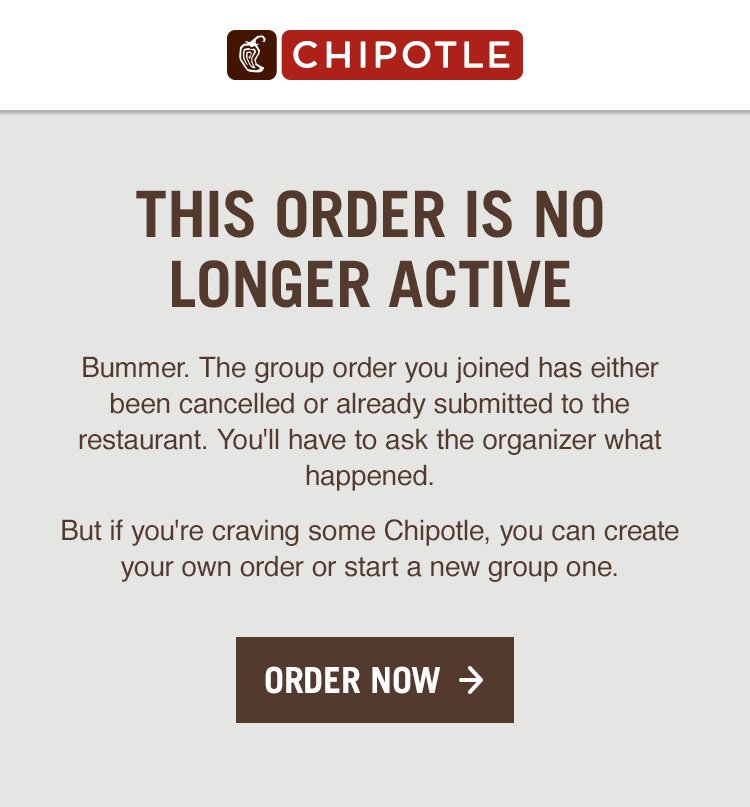
Another case to consider was the time sensitivity of the group order. Once the organizer sets the order in motion, invitees have a limited time to respond (which is fair, because the organizer herself is probably hungry and can’t wait on people who are afk indefinitely).
For people who respond too late, there’s this:
While UX writing has to be as short and sweet as possible, I sought out places to include the snappy language the chain has become known for, livening up the Chipotle mobile app’s first open screens.
I also left a mark on the sitewide change/reset password flow. Passwords are like salsa, and password strength meters don’t need to be the same dry thing everywhere you go.


