
Miami-based startup Willing helps people create legally binding wills online, in minutes, changing the game for anyone daunted by estate planning (pretty much everyone). The task was to overhaul the look and feel of the website and re-think and enliven the messaging.
What informed my initial thinking was the question of how to speak to the audience in a way that skirted around the topic of death. It’s an uncomfortable truth to face, and avoidance of it is what keeps people from making the concrete plans that are essential to protecting the people they love. As I set about crafting a new narrative for the homepage, I decided that the way to push people to take action was to not bring up the inevitability of death but to emphasize practicality as well as appeal to users’ love for the people closest to them.
My design counterpart and I were asked to focus on the homepage, and in scrutinizing the existing one, I saw it was short on imagery, color, and approachable, friendly language. The nav bar was bloated and the only image on the homepage felt slightly macabre—full of warm tones and innocence but with the presumed mother of the child blurred and receding into the background. Here’s the before state I’m talking about:

The rest of the page was made up of modules like the two below, full of stark icons and the same call to action button, with language that was inadvertently terse. Some headlines didn’t mesh with the content below them, or missed an opportunity to convey an end benefit or lean into a key value prop. For example, in the first, the headline promotes Willing’s credibility through number of users, but the tiles below highlight very different things. The first two “match” in telling users what they can do through creating a will, while the third promotes ease of use.

Other observations from my homepage audit were:
Hero copy lacks emotion and warmth, cramming in the value prop of “free, legal, online”
Key proof points are sprinkled across modules, dampening their efficacy
Logos in Press module do not link to articles
Contact info is in main nav instead of footer, and there are no social links
No founder/advisor “voices” to humanize the company
My recommendation was to:
Bring in more emotion and humanness; make sure the company sounds passionate about what they do
Subtly acknowledge pain points around making a will; promise attentiveness to users’ individual needs
Tease out the different layers of trustworthiness: the quality and legality of the product, and the security of user information
Streamline messaging and narrative down the page, thinking through each module’s focus and order of priority
Drive users into different areas of the site through distinct CTAs
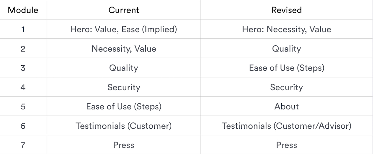
That led to my proposing the focus of each module on the homepage:
The final homepage incorporates original graphics, images of loving relationships, and copy that is warm, personal, and addresses users’ needs. The copy calls out peace of mind and the product’s ease of use, and promises very approachable pricing. We drastically reduced the number of items in the nav bar and placed Pricing first, anticipating it as something a user would click into more readily than About.
The homepage messaging doesn’t completely follow the hierarchy I presented; for one, we dropped the About module after debating how much to tout the founder story, and we rounded out the page with two more. The second to last pushes people to explore different packages once they’ve been convinced of Willing’s expertise. The final module provides another bit of reassurance that Willing is your partner through what is inherently a very confusing process.
The revised homepage acknowledges that making a will is an easy task to delay, and nudges people to get the process going out of care for the people who will benefit from it. Here it is.
